File:World Map - Mercator projection v Google maps.jpg: Difference between revisions
Jump to navigation
Jump to search
Siterunner (talk | contribs) No edit summary |
Siterunner (talk | contribs) No edit summary |
||
| Line 13: | Line 13: | ||
Most popular mapping apps in the US as of April 2018, by monthly users | |||
:Google Maps (154 Million) | |||
:Waze (25.6 M) | |||
:Apple Maps (23.3 M) | |||
:Mapquest (20.9 M) | |||
:Google Earth (5.2 M) | |||
:Yahoo! Maps (2.8 M) | |||
🌎 | |||
[[Category:Country]] | [[Category:Country]] | ||
[[Category:Maps]] | [[Category:Maps]] | ||
[[Category:Additional Website Resources - Linked Data - Green Best Practices]] | [[Category:Additional Website Resources - Linked Data - Green Best Practices]] | ||
Latest revision as of 18:37, 23 August 2020
<addthis />
Despite inaccurate visual features – or perhaps because of them – the Mercator projection achieved widespread adoption around the world. This includes the classroom, where young minds are first learning about geography and forming opinions on relationships between countries.
Google, whose map app is used by approximately 150 million people per month, recently took the bold step of overlaying their map onto a globe. This change sidesteps projection issues completely and displays the world as it actually is: round.
Most popular mapping apps in the US as of April 2018, by monthly users
- Google Maps (154 Million)
- Waze (25.6 M)
- Apple Maps (23.3 M)
- Mapquest (20.9 M)
- Google Earth (5.2 M)
- Yahoo! Maps (2.8 M)
🌎
File history
Click on a date/time to view the file as it appeared at that time.
| Date/Time | Thumbnail | Dimensions | User | Comment | |
|---|---|---|---|---|---|
| current | 18:30, 23 August 2020 | 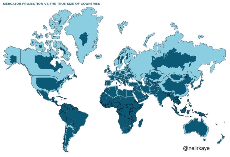 | 800 × 545 (101 KB) | Siterunner (talk | contribs) |
You cannot overwrite this file.
File usage
The following page uses this file:
Categories:
- Country
- Maps
- Additional Website Resources - Linked Data - Green Best Practices
- Air Quality
- Air Pollution
- Aquifers
- Atmospheric Science
- Biodiversity
- Citizen Science
- Clean Air
- Climate Change
- Desertification
- Digital Citizen
- Earth360
- EarthPOV
- Earth Imaging
- Earth Observations
- Earth Law
- Earth Science
- Earth Science from Space
- Earth System Science
- Ecology Studies
- Education
- Environmental Full-cost Accounting
- Environmental Protection
- Environmental Security
- Environmental Security, National Security
- EOS eco Operating System
- Externalities
- Forest
- Forests
- Green Graphics
- Health
- Land Ethic
- New Space
- Oceans
- Permaculture
- Planet API
- Planet Citizens
- Planet Scientist
- Planet Citizens, Planet Scientists
- Planetary Science
- Population
- Strategic Demands
- Sustainability
- Sustainability Policies
- ThinBlueLayer
- Virtual Earth
- Virtual Planet
- Water
- Whole Earth
- Biogeosciences
- Cryosphere
- Geology
- Geophysics
- Geophysics and Geochemistry
- Hydrology
- Mineralogy
- Natural Resources
- Ocean Science
- Space Science and Space Physics